When it comes to clothing, styling colors in an outfit can feel intimidating, but I promise it’s a breeze if you have two things: a formula and the right pieces to pair. Here’s a guide on how to style color in a way that will make your outfits look eye-catching and put together.
Aim for Cohesion and Contrast
The best outfits are full of contrast but appear cohesive overall. Visual appeal is achieved through contrast, while maintaining a theme of shades rather than a random mix of colors provides cohesion.
Know Your “Levers”
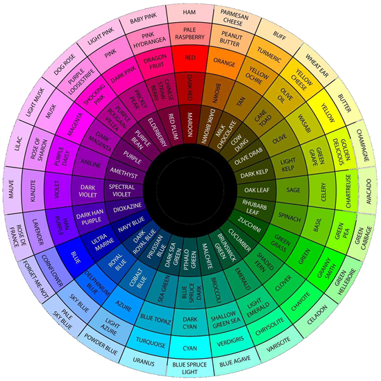
Hang with me through this technical piece because I promise it’s easy to apply! Remember the color wheel from art class? To pair colors well, you’ll need to know the “levers” you can pull to adjust each color on the wheel. Your levers are the three properties that make up every color: hue, saturation, and brightness.
Hue—A color’s exact spot on the wheel. For example, pure orange versus peach.
Saturation—How intense the color is. Very saturated = bright and intense. Less saturated = closer to black or white.
Brightness—The relative lightness of a color from black (0%) to white (100%).
Use Color Formulas
Now that we’ve laid the technical foundation, let’s get to the formulas. The best looking outfits have color harmony (contrast and cohesion), which can be achieved with some simple formulas:
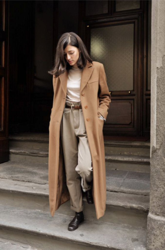
Color Formula 1 / Monochromatic
Items in a monochromatic outfit share a single hue but vary in brightness and saturation. If you incorporate a bold color, you can supplement your monochromatic shades with gray, black, or white for balance (see purple outfit below).
Examples
‘Ivory’ Monochrome
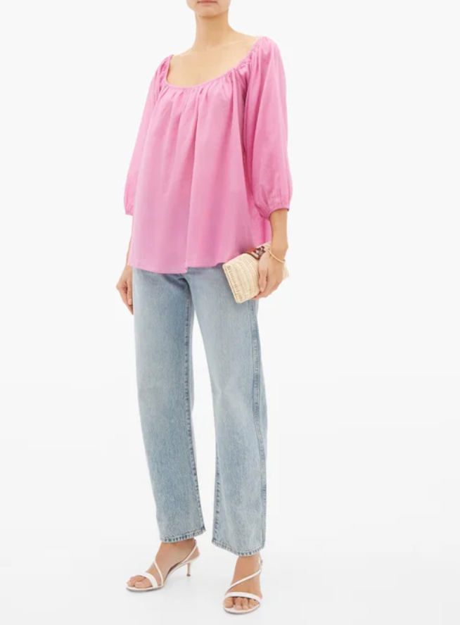
Pink Monochrome
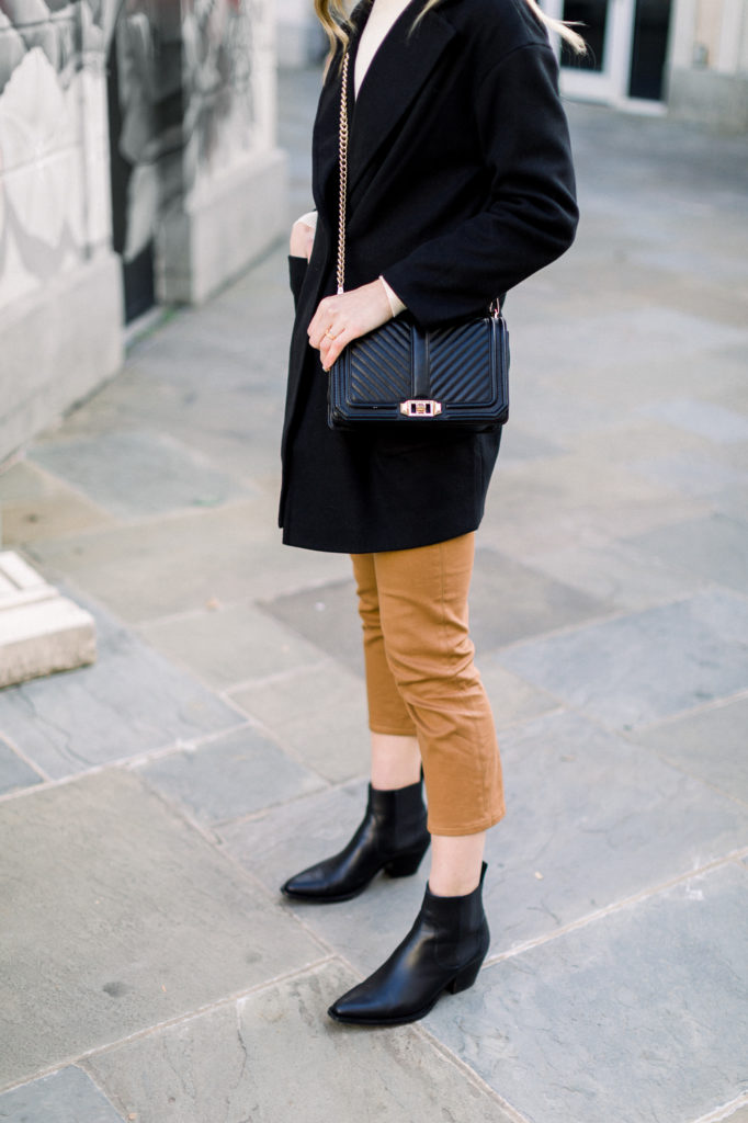
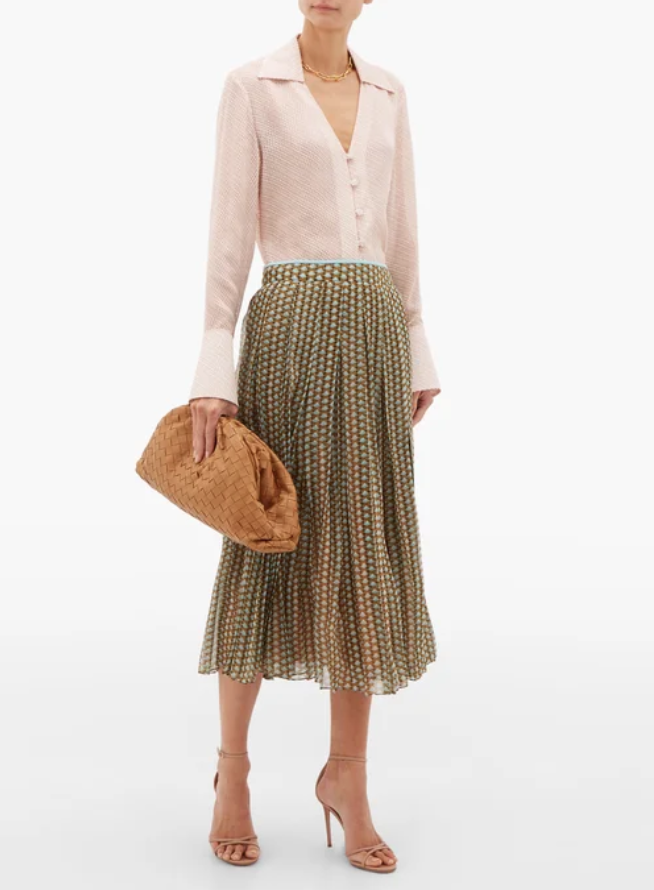
Brown Monochrome
Purple Monochrome (toned down with white tee)
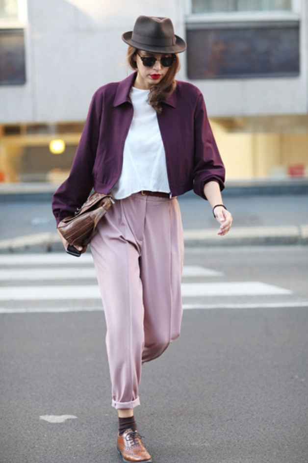
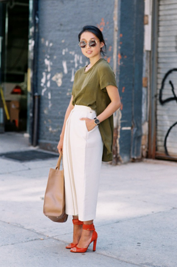
Color Formula 2 / Complementary
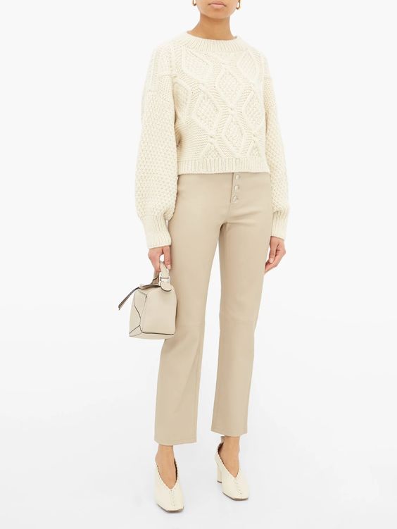
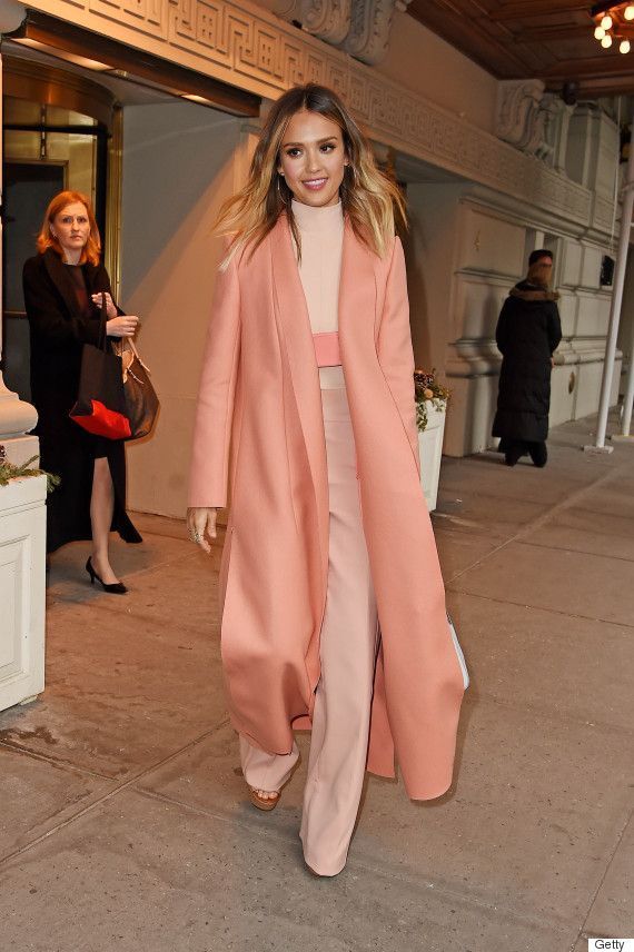
Items in a complementary outfit have two hues roughly opposite on the color wheel. Think green + pink, blue + orange, and yellow + purple. Not all complementary outfits bold and colorful! For example, a sand trench coat with light blue denim is considered complementary. Pairing two pure complementary hues can look overwhelming, so try deepening one of the hues to soften the look. Just like monochrome outfits, you can incorporate neutrals to add balance and provide separation for bright colors (second outfit below).
Examples
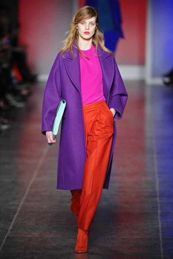
Blue + Red (Cognac)
Green + Red (with white pants to soften)
Pink (hue of red) + Green
Pink (shade of red) + Blue (yes, denim is a color!)
Color Formula 3 / Analogous
Items in an analogous outfit consist of neighboring hues on the color wheel. For example, red, yellow, and orange. If you’re using all bold hues, (i.e. pure orange, yellow, and red), consider adding a neutral layer for balance. An analogous look will appear more cohesive if all the colors share the same level of saturation or brightness.
Examples
Red + Pink + Purple
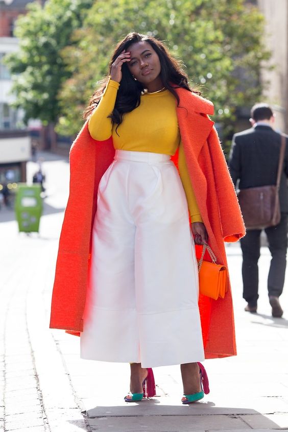
Red + Orange + Yellow + Green (Shoes!)
A Word About Neutrals
Ah, neutrals, my love. My closet is definitely less pronounced and more neutral. It fits my personality and offers practical benefits.
Neutrals can be paired with any outfit without destroying its overall cohesion because black, white, and gray aren’t technically colors.
Neutrals look stunning when paired together with other neutrals. They’re naturally cohesive, so varying tones, adding accessories with a pop, and varying textures add necessary contrast.
Examples
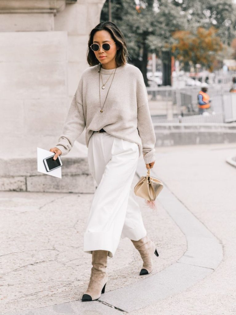
Notice how the textures add interest!
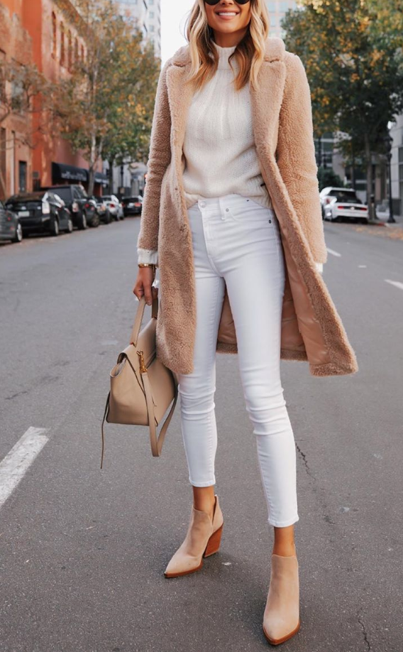
Interest from the coat’s texture
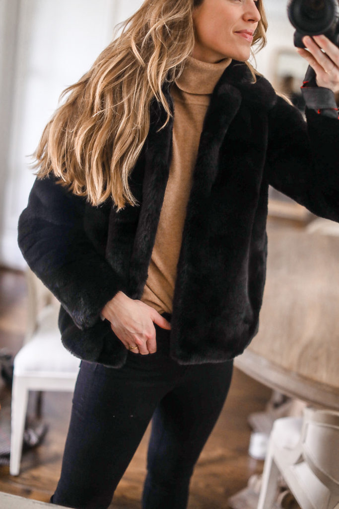
Interest from textures, again
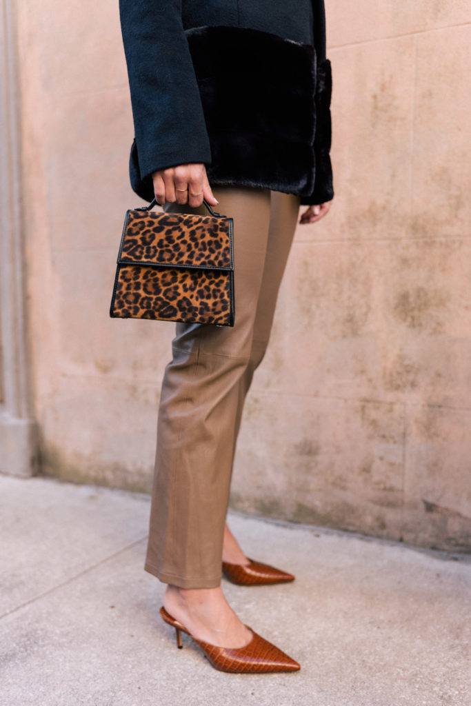
Interest from the ‘pops’ of pattern/texture (leopard bag, croc shoes)
What’s your favorite formula for styling colors in an outfit? Do you want to see more styling how-tos in the future? I’d love to know in the comments or on Instagram!
xo,
Natalie

)